dylan_black_2025
J
Jeanne Stansak
dylan_black_2025
J
Jeanne Stansak
AP Microeconomics 🤑
95 resourcesSee Units
A monopoly is a market structure in which an individual firm has sufficient control of an industry or market. They determine the terms of access to other firms.
A natural monopoly occurs when an individual firm comes to dominate an industry by producing goods and services at the lowest possible production cost. Since other firms cannot compete with these low costs, it drives them out of the business and allows the dominant firm to monopolize the industry. Natural monopolies are actually beneficial to society because they charge low prices and promote productive efficiency.
Characteristics of Monopolies
- One, large firm (the firm is the industry): In a monopoly, there is only one large firm operating in the industry, effectively making it the industry itself.
- Firms are "price makers": Monopolies have the power to set prices for their products or services, rather than being subject to market forces like firms in competitive markets.
- High barriers to entry: There are high barriers to entry in a monopoly, making it difficult or impossible for other firms to enter the market. These barriers can be economic, legal, or related to access to resources.
- Firms earn long-run profits: Monopolies often earn long-run profits because they do not face competition and can charge higher prices. There is also no long-run adjustment like in perfect competition since a monopoly is the entire market
- Products sold are unique: Monopolies typically sell unique products or services that are not offered by other firms in the market.
- Non-price competition is used: Non-price competition, such as advertising or improving product quality, may be used by a monopoly to differentiate itself from potential competitors.
- Firms are inefficient if they are left unregulated: If left unregulated, monopolies may be inefficient due to lack of competition, which can lead to higher prices and reduced innovation. Government regulation can help to promote competition and prevent monopolies from becoming too powerful.
Graphing Monopolies
In a monopoly graph, the demand curve is located above the marginal revenue cost curve. This is because they have to lower their price in order to sell each additional unit. This is known as the inability to price discriminate. Because demand is decreasing, a consumer's willingness to buy at a higher Q is lower, meaning the additional revenue you'll receive from each unit decreases.
For a monopoly, the marginal revenue curve is lower on the graph than the demand curve, because the change in price required to get the next sale applies not just to that next sale but to all the sales before it. For example, if you can sell 5 units for $10 each, but 6 units for $8 each, you have to sell each of those first 5 for $8, not $10, meaning your marginal revenue is always less than demand.
This is kind of a tricky fact to wrap around your head, but in essence, MR < D because a monopoly cannot price-discriminate. Its additional revenue is always less than what you're willing to pay at that quantity because it's selling a higher quantity. If the firm could charge your exact willingness, MR would equal D.
Their profit-maximizing profit output is where MR=MC. The price is determined by going from where MR=MC, up to the demand curve.
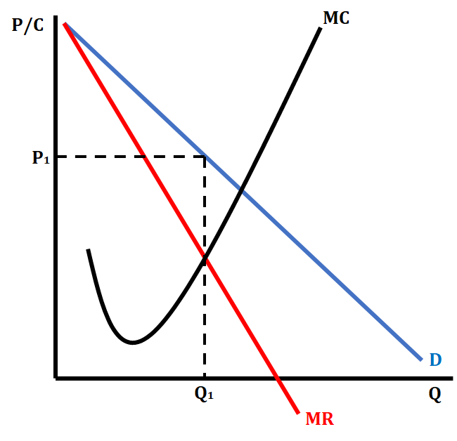
The graph above shows a standard monopoly graph with demand greater than MR. It also shows the profit-maximizing output where MR = MC at Q1. You then determine the price by going up from Q1 to the demand curve and labeling the profit-maximizing price at P1. We go up to the demand curve to determine price because we, as a monopoly, have market power, and thus have some control over the price. This means we can charge the maximum willingness to pay at that quantity, which is what the demand curve defines. Therefore, we don't go over to price at MR, we do so at D.
Profit and Loss on a Monopoly Graph
Many times, when drawing a monopoly graph, we are asked to show either a profit or a loss. We use the cost curve, ATC, to show it. When we are showing a profit, the ATC will be located below the price on the monopoly graph. We shade the area that represents the profit.
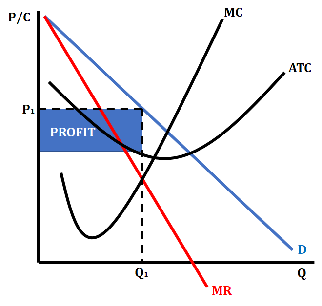
Monopoly Graph Showing a Profit
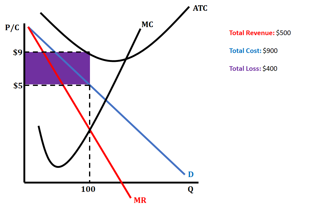
When we are showing a loss, the ATC will be located above the price on the monopoly graph. We shade the area that represents the loss.
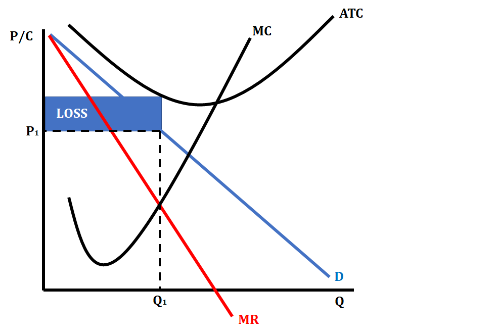
Monopoly Graph Showing a Loss
Finding this rectangle is pretty much the same as in perfect competition: find our price point, go up or down to the ATC, and then go over to finish off the rectangle. This rectangle will be our profit or loss. Alternatively, you can find total revenue and total cost's rectangles and then find that difference. There will either be excess revenue (profit) or excess cost (loss).
Calculating a Monopoly's Profit
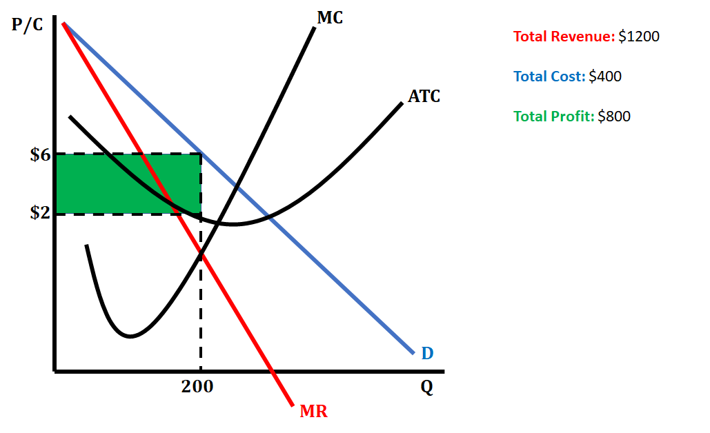
In this particular graph, the firm is earning a total revenue of $1200, which is calculated by multiplying the price they are receiving for each unit by the profit-maximizing output. The total cost is the value of the ATC multiplied by the profit-maximizing output ($2 x 200 = $400). The profit is calculated by subtracting total cost from total revenue ($1200 - $400 = $800).
You can also use the area of a rectangle formula to calculate profit!
Calculating a Monopoly's Loss
In this particular graph, the firm is earning a total revenue of $500, which is calculated by multiplying the price they are receiving for each unit by the profit-maximizing output. The total cost is the value of the ATC multiplied by the profit-maximizing output ($9 x 100 = $900). The loss is calculated by subtracting total cost from total revenue ($500-$900 = -$400).
You can also use the area of a rectangle formula to calculate loss!
Monopoly and Efficiency
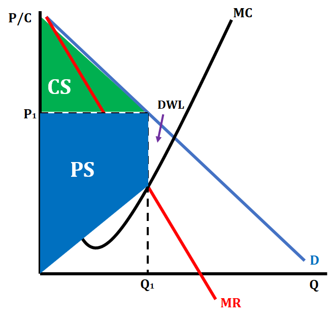
In a perfectly competitive market, firms are both allocatively and productively efficient. One of the ways this is shown is when perfectly competitive firms maximize consumer and producer surplus. Monopolies, on the other hand, are not allocatively and productively efficient because they overcharge and underproduce. Below is a graph that shows consumer and producer surplus on a monopoly graph as well as deadweight loss, the loss of consumer and producer surplus due to inefficiency.
Note that a monopoly underproduces in a market. The socially-optimal quantity and price for this market would be the point where D = MC. Instead, a monopoly deliberately underproduces and overcharges, causing deadweight loss.
Key Points on a Monopoly Graph
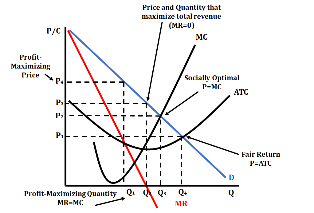
There are many key points that we should be familiar with on a monopoly graph (please see the graph below to identify all these key points).
- Profit-maximizing price and output (sometimes referred to as loss-minimizing): The output is determined where MR = MC, and then we go up to the demand curve and over to identify the price. (On the graph below it is Q1 and P4.) This is the point we identified earlier
- Socially optimal price and output: This is located where P = MC. This is also referred to as the allocatively efficient point on a monopoly graph. This point requires regulation from the government in order to produce here. This is usually done via a price ceiling, which keeps prices low. This forces the monopoly to produce a more allocatively efficient output and eliminate deadweight loss (DWL). (On the graph below it is Q3 and P2.). However, this could also lead to losses if ATC is higher at the socially optimal point.
| Pros | Cons |
| Increases output | Firm is still productively inefficient (P != min ATC) |
| Decreases price level | Can drive the firm to experience losses |
| Forces the firm to produce the allocative efficient level of output |
- Fair-return price and output: This is where P = ATC. This should not be confused with the productively efficient point of P = minimum ATC. This is the point on a monopoly graph where total revenue (TR) = total cost (TC), meaning that the monopoly makes a normal profit. This is usually accomplished via a price ceiling. (On the graph below it is Q4 and P1.). At this point, profits are normal, but there may still be a small amount of deadweight loss. This is oftentimes a compromise between the profit-maximizing point and the socially-optimal point.
- Price and output that maximizes total revenue (TR): This is located where MR=0. This point is also used to identify the elastic and inelastic parts of the demand curve. (On the graph below it is Q2 and P3.)
| Pros | Cons |
| Increases Ouput | Firms can be over-allocating resources |
| Decreases Price Level | Firms may be overproducing |
| Can force the firm to become more productively efficient | May require a government subsidy to enforce |
Monopoly Graph and Elasticity
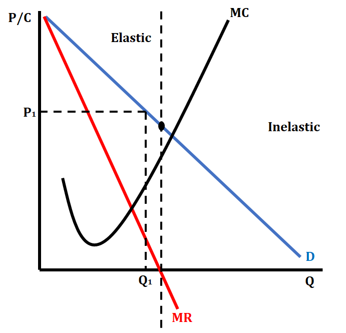
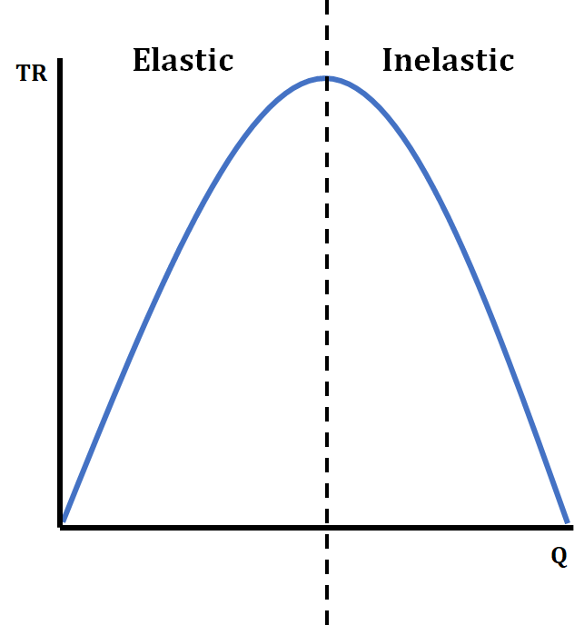
The demand curve on a monopoly graph have both elastic, inelastic, and unit elastic sections. We use the quantity where MR=0 to determine the difference. We first draw a line from the quantity where MR=0 up to the demand curve. The point where it hits the demand curve is the unit elastic point. The section above this point is the elastic region of the demand curve, and the section below this point is the inelastic region of the demand curve.
In the elastic region, a monopoly can lower the price and still increase their total revenue (TR). However, in the inelastic region, if they lower their price, they decrease their total revenue (remember the Total Revenue Test!). A monopoly will never willingly produce in the inelastic region because it would lower their profits (marginal revenue is negative, while marginal costs continue to increase. In order for them to produce in the inelastic region, the government has to regulate them with a price ceiling or provide support through a subsidy. (See the graph of both a monopoly and a corresponding TR curve below).
Browse Study Guides By Unit
💸Unit 1 – Basic Economic Concepts
📈Unit 2 – Supply & Demand
🏋🏼♀️Unit 3 – Production, Cost, & the Perfect Competition Model
⛹🏼♀️Unit 4 – Imperfect Competition
💰Unit 5 – Factor Markets
🏛Unit 6 – Market Failure & the Role of Government
🤔Exam Skills
📚Study Tools

© 2024 Fiveable Inc. All rights reserved.